
Stand across the street from two houses with identical doors and one often looks “designed” while the other looks assembled. The difference is rarely the door itself. It’s proportion — how the hardware’s scale, shape and position relate to the surface it sits on, and to the person standing in front of it.
Proportion is the invisible half of entrance design. Color gets discussed; placement gets guessed. This article is about getting the guessed part right — where a lock and handle should sit, how scale reads at a distance, and how the same hardware can look deliberate on one door and accidental on its neighbor.
The three proportions at every entrance
Every front door is a composition of three measurable relationships:
Read the door as ratios, not as dimensions
- Hardware-to-door. The lock and handle occupy a fraction of the door’s face. Slim hardware on a wide door reads minimal and modern; chunky hardware on the same door reads heavy and traditional. Neither is wrong — but mixing the register across the two sides of the door is where entrances start to look accidental.
- Hardware-to-hardware. Handle height, lock position, and their spacing form a miniature composition of their own. Most entrances keep the primary grip at a consistent height — roughly a hand’s natural drop from the shoulder — and let the lock body relate to the handle rather than float independently.
- Hardware-to-façade. The entrance sits in the elevation of the building: the door, the frame, the wall, the canopy, the step. Hardware proportions that match the door can still look small or loud against the broader façade — which is why entrance design is decided at the elevation, not at the product page.
Why lock placement drifted upward
Traditional deadbolt placement was dictated by mechanics: the bolt had to sit at a height where the lock body could mount cleanly within the door’s rails and stiles, and the strike could land in the frame. That put deadbolts around a hand’s length above the handle on most residential doors — a convention that smart locks inherited, because most smart deadbolts still replace a deadbolt.
What’s changed is the lock itself. A modern smart lock is often taller — it includes a keypad, a fingerprint reader, sometimes a screen — and its visual mass is no longer just a small cylinder. That’s why so much of entrance design guidance now talks about the lock as a vertical element: on a tall door with narrow stiles, a slim full-height lock reads as part of the door’s line; on a paneled cottage door, the same lock can look like an appliance bolted on.
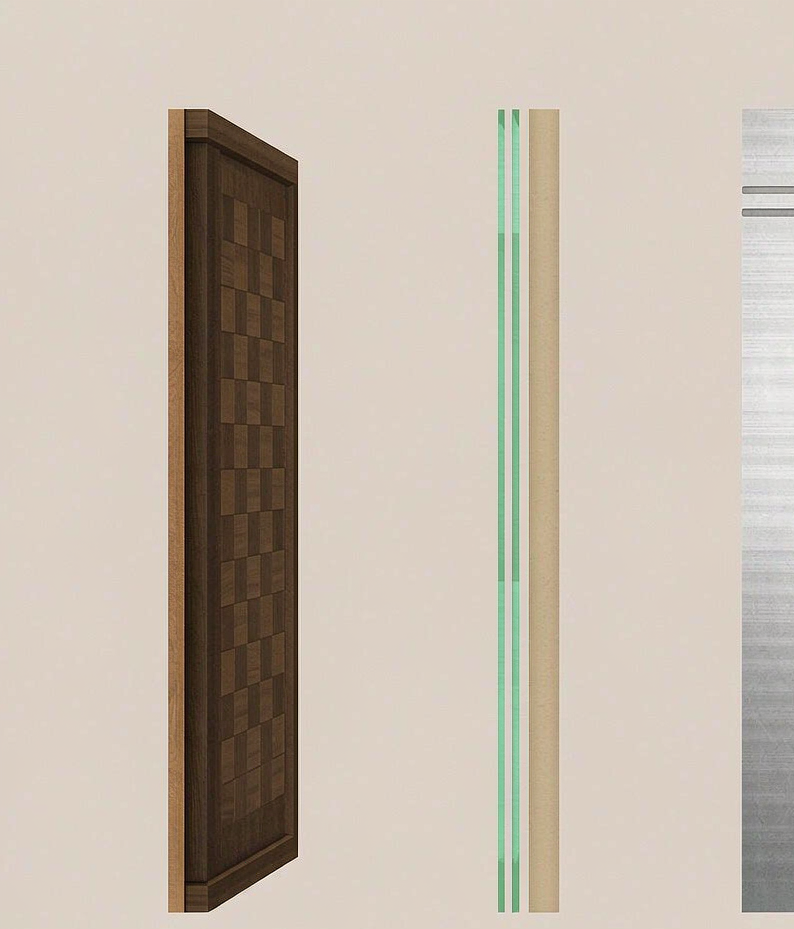
Scale in practice: the same lock on three doors
Walk through how one lock family behaves across door types and the proportion principle becomes concrete. Take a slim, tall smart lock — the shape most modern models share:
- On a wide contemporary timber door: the slim vertical lock aligns with the door’s clean geometry. Handle and lock read as one group. Minimal, deliberate.
- On a narrow aluminum entrance: the lock nearly matches the frame’s own proportions — it can be the dominant hardware element, which is why designs often lean slimmer and darker on metal entrances. Our aluminum-door range, including the LK0161, is built specifically for this context where a standard deadbolt body simply doesn’t belong.
- On a paneled heritage door: the same lock becomes a modern intrusion unless the entrance commits to the contrast deliberately. Here, warm finishes and hardware that echoes traditional shapes carry the composition — which is part of why bronze and brass tones flourish on classic doors while black dominates contemporary ones.
The lesson isn’t that one door type is better. It’s that the lock’s visual register has to be chosen with the door, the way the handle already is. A mismatch reads as “someone picked this online”; a match reads as design.
A ten-second proportion check: stand back ten paces and squint. You should still be able to say what the door’s design language is — clean and modern, warm and traditional, or technical and glassy — without reading any details. If the hardware is arguing with the door at ten paces, no finish will settle the argument at one.
The human proportion
There’s a second audience for proportion: the person at the door. Reach ranges, hand height, where the eye lands when approaching — the entrance is also a piece of ergonomics, and the best entrances serve both audiences at once.
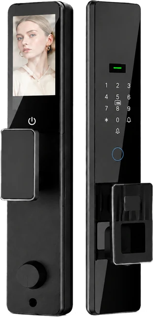
This is where design and function converge in today’s hardware. Handles at comfortable grip height; a reader positioned where a hand naturally arrives; a keypad where it can be seen in evening light. Modern smart locks — including ours — are at their most successful when the interaction points are placed as carefully as the surfaces. The fully automatic DDL1, for example, integrates its display at the height the eye meets the door, and the slim silhouettes across the range exist partly so those interaction points stay where a hand expects them rather than forcing the composition around them.
Proportion in projects: where it goes wrong at scale
For architects specifiers and multi-unit projects, proportion failures are usually consistency failures rather than single-door mistakes:
- The mixed-generation entrance. A building renovated door by door ends up with four hardware styles at the same address. The fix is one hardware standard for all common areas and a coherent family for unit doors — which is easier when the range documents its finishes and sizes per model, as ours does.
- The scale mismatch between unit and lobby. Lobby entrances read at a different distance than apartment doors. Hardware with enough visual weight for a lobby can overwhelm a unit door, and vice versa. Two register choices, not one, usually serve a building best.
- The afterthought back door. Secondary doors often get whatever was left over. In practice, a single coherent line carried through main and secondary doors — even in different families — avoids the patchwork look that tenants notice on move-in day.
Common questions
Does a bigger lock always look more secure?
No — and the correlation in real design is often the reverse. Slim hardware on a solid door reads confident; bulky hardware can read as compensating. What actually communicates security is the door’s mass, the frame’s solidity and the hardware’s precision, none of which is a size contest.
Should main and secondary doors match exactly?
They should share a design language — consistent finish family, related proportions — but identical models aren’t required, and door fit often makes them impractical. The coherence readers perceive is about register, not catalogue numbers.
Where should the lock sit relative to the handle?
On deadbolt-style doors, the lock sits above the handle at a standard offset; on integrated designs the lock and handle are a single composition. What matters practically is reach: the reader or keypad should land where a hand arrives naturally, and the handle should sit at comfortable grip height. Those two constraints define the composition more than any stylistic rule.
Specifying entrances for a project?
Tell us your door types and elevation intent. CaremLock supplies smart lock families across residential, aluminum and glass doors with documented finishes and dimensions — so the entrance composition holds from the drawing to the delivery.
Or explore the full range and contact the team.