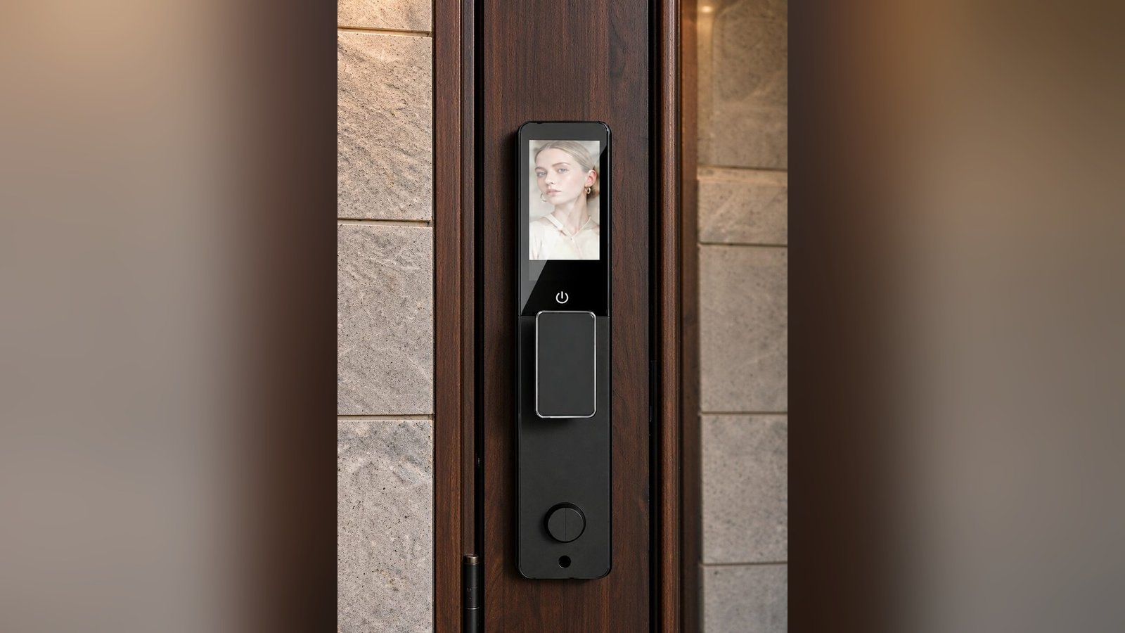
A front door is the first thing a visitor touches and the last thing the household touches at night. On that door, the lock is the one piece of hardware that is both decoration and daily tool — it has to look right on a Sunday afternoon and work right at midnight.
Most lock content talks about features. This one is about the part you can’t demo in a spec sheet: how finish, material, and visual weight decide whether a smart lock looks like it belongs on the door or looks like it was added later. For distributors and specifiers, this is also the conversation that closes sales — a buyer’s objection is rarely “does it unlock”; it’s “will it look right on the building”.
The three finish families — and what they ask of the door
Walk any hardware showroom and the smart locks sort into three visual families. Each carries a different message, and each has a different failure mode when it’s mismatched.
The families
- Black family (matte black, graphite, dark pewter). The default of the smart-lock decade, and still the safest choice for modern doors. What’s changed is the direction: finishes are moving from flat black toward graphite and dark pewter with softer, warmer undertones, and satin rather than fully matte surfaces. On dark or painted doors it disappears into the composition — which is its point: minimal, quiet, “engineered”.
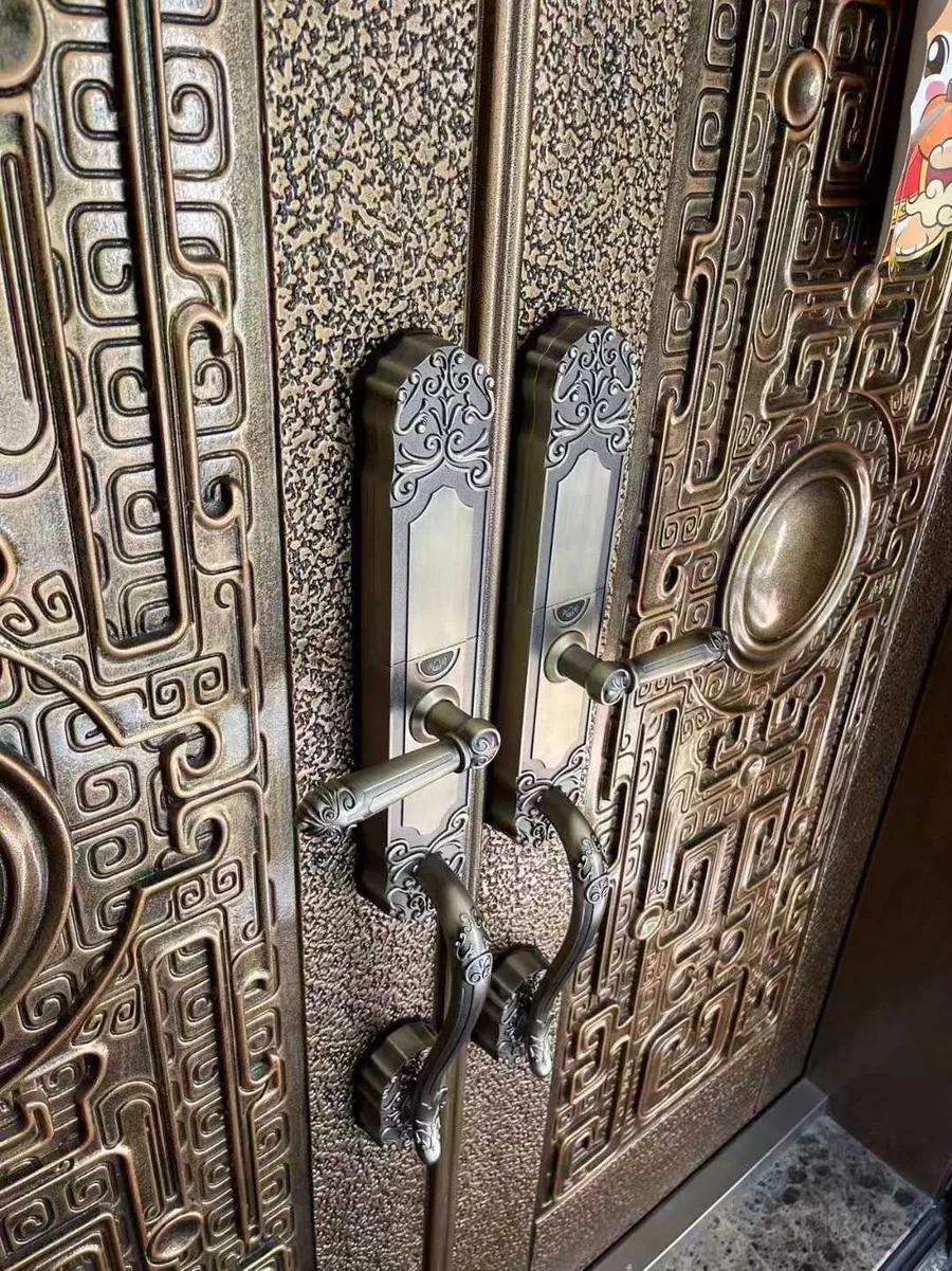
- Warm family (bronze, brass, satin gold, red bronze). Trending upward specifically because black has been everywhere. Warm tones on dark timber or stone read as deliberate and hotel-like; on white doors they read as classic. The trap is temperature mismatch: a warm bronze on a cold silver-toned frame, or a gold leaning cool, can look accidental.
- Neutral family (silver, satin nickel, gray). The perennial for contemporary and commercial work. Satin nickel in particular exists because it forgives fingerprints and blends across palettes — the reason it dominates hotel corridors.
Mixed-metal looks are a real trend, not a mistake — but the rule designers repeat is consistency of temperature: matte black with brass works when the palette agrees on “warm”, and clashes when one piece leans cool. If in doubt, match the door and frame before the furniture.
Beyond color: material and glass are the second read
Finish is what you notice from the sidewalk; material is what you notice standing at the door. Two things carry most of that impression:
- The body material and its surface treatment. A CNC aluminum body reads as precise and technical; a glossy panel reads as consumer electronics; a brushed panel reads as instrument. In our range, the DDL1 states CNC aluminum alloy with a tempered glass panel, and the DDA2 states an aluminum alloy body in matte black. Different doors will ask for different answers — a wood villa and a glass office door should not read the same.
- Glass panels and displays. A dark reflective panel adds depth on modern doors and disappears against dark frames; on light timber doors it becomes the visual anchor of the entire entrance. If the door display shows content (like video intercom), the composition effectively has a small screen on it — plan the visual weight of that accordingly.
Match the lock to the door — four real combinations
The combinations below are the ones buyers ask about most, described in plain terms. They are composition advice, not rules:
- Dark timber / walnut entrance → warm bronze or dark graphite. The classic villa look: bronze for warmth, graphite for restraint. Both work; the difference is whether you want the hardware to glow or to recede.
- Light oak or painted-white door → matte black or satin nickel. Black gives the modern contrast most contemporary homes are after; satin nickel keeps the entrance airy and works if the door furniture is already silver.
- Black steel door / dark frame → dark lock, but check the tone. Black-on-black only works when the undertones agree; a warm charcoal lock on a cool flat-black door can read as two different blacks — the same trap as mixing “matte black” from different vendors.
- Framed glass / aluminum office doors → slim dark hardware. Slim profiles with black or dark-gray finishes keep glass entrances technical. This is exactly where our aluminum and glass door families live — see the aluminum door range for how those locks mount differently from a wood-door deadbolt.
What finishes can our own range actually state?
Design articles love adjectives; buyers need verifiable statements. Here is what our own product documentation states — nothing more:
- LK0161 (aluminum door): offered in Black or Red bronze — per its model page.
- DDA2 (semi-automatic): aluminum alloy body in Matte Black, with optional remote control and modules.
- DDL1 (fully automatic): CNC aluminum alloy body with tempered glass panel — the technical/glossy read described above.
Where a finish or color option isn’t listed in a model’s documentation, we don’t invent one here. If a project needs a specific finish family across multiple door types, tell us the doors and the palette — the answer may involve selecting across series, or a defined customization path, and that’s a conversation, not a guess.
For distributors: finish is an inventory decision
One practical B2B reality: every finish you stock is a separate SKU to forecast. Markets differ — some lean black-heavy, others buy bronze. The healthier approach for most distributors is a core finish carried deep, plus a second finish by request, rather than three finishes carried thin. And for project buyers: order samples of the actual finish before the full order; photographs flatter finishes, doors do not.
Common questions
Does matte black show fingerprints?
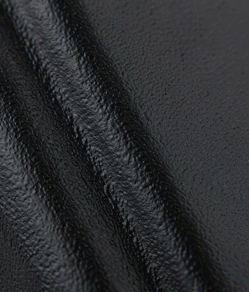
Less than gloss, more than you’d hope — matte surfaces scatter light and diffuse smudges, which is exactly why they photograph so well, but skin oils are still visible up close on dark matte panels. The practical answer is a soft damp cloth, no abrasives; abrasive pads and harsh chemicals damage powder-coated and painted surfaces.
Will bronze or gold finishes fade outdoors?
Real durability depends on the finish technology and climate, and that data belongs to the specific product — ask for the documentation rather than trusting a general claim. What we can say honestly for our range: where a finish is stated on the model page (for example LK0161’s Black / Red bronze options), that is the statement we stand behind; where it isn’t, we don’t extend a claim.
Can I keep the same finish across a multi-door project?
Within a series, usually yes — that’s one reason to select the series first and the finish second. Across door types (wood, aluminum, glass), the honest answer is that the catalog may require matching across more than one series; send us the door list and the required palette and we’ll map what’s achievable and what isn’t.
Specifying locks for a design-led project?
Tell us the doors, the palette, and the volumes. CaremLock supplies smart lock ranges for distributors, specifiers, and project buyers — and we’ll answer finish questions from the product documentation, sample by sample.
Or explore the product range and talk to the team — physical samples start every good finish conversation.